popcompr is an R package to make it easier to compare different high resolution population datasets for humanitarian and research purposes. It is under active development and has not been released, but the code is available through a GPL3 license.
To install package from github:
remotes::install_github("mrajeev08/popcompr")
An example comparing 2019 population estimates for Lesotho from World Pop & Facebook/CIESIN
Included in the package are files to reproduce a minimal working example for the country of Lesotho. lesotho_wp_2019 and lesotho_fb_2019 are included in the package (use ?lesotho_wp_2019 for more details).
First load the necessary libraries
- some extras for plotting (plotly & ggplot2)
library(popcompr) library(raster) #> Loading required package: sp library(data.table) #> #> Attaching package: 'data.table' #> The following object is masked from 'package:raster': #> #> shift library(foreach) library(plotly) #> Loading required package: ggplot2 #> #> Attaching package: 'plotly' #> The following object is masked from 'package:ggplot2': #> #> last_plot #> The following object is masked from 'package:raster': #> #> select #> The following object is masked from 'package:stats': #> #> filter #> The following object is masked from 'package:graphics': #> #> layout library(ggplot2) library(fasterize) #> #> Attaching package: 'fasterize' #> The following object is masked from 'package:graphics': #> #> plot #> The following object is masked from 'package:base': #> #> plot library(sf) #> Linking to GEOS 3.8.1, GDAL 3.1.4, PROJ 6.3.1
Comparing populations at pixel level
You can first get an estimate of the time required to return the comparison:
# comparing at pixel level with data included in the package lesotho_fb_2019 <- raster(system.file("external/lso_facebook_2019.tif", package="popcompr")) lesotho_wp_2019 <- raster(system.file("external/lso_worldpop_2019.tif", package="popcompr")) pop_list <- list(lesotho_wp_2019, lesotho_fb_2019) compare_pop(pop_list, parallel = FALSE, estimate_time = TRUE) #> It will take approximately 22.73 seconds to complete the full job serially.
It shouldn’t take too long by that estimate, but here we’ll work through parallelizing. Here, I use the doParallel backend, but other do packages can be used (anything compatible with the %dopar% infix in the foreach package).
# parallelized example library(doParallel) #> Loading required package: iterators #> Loading required package: parallel cl <- makeCluster(detectCores() - 1) # how many cores do we have available registerDoParallel(cl) system.time( # defaults to estimate_time = FALSE & resolution of ~ 1km at equator exe <- compare_pop(pop_list, parallel = TRUE) ) #> user system elapsed #> 0.540 0.039 21.549 stopCluster(cl)
compare_pop will warn you if any people were not resampled to the comparison grid (this happens sometimes when pops are at the edge of the original raster).
The output is a raster brick with a layer corresponding to each of the input population rasters. We can vizualize and compare the rasters:
Vizualizing and summarizing comparisons
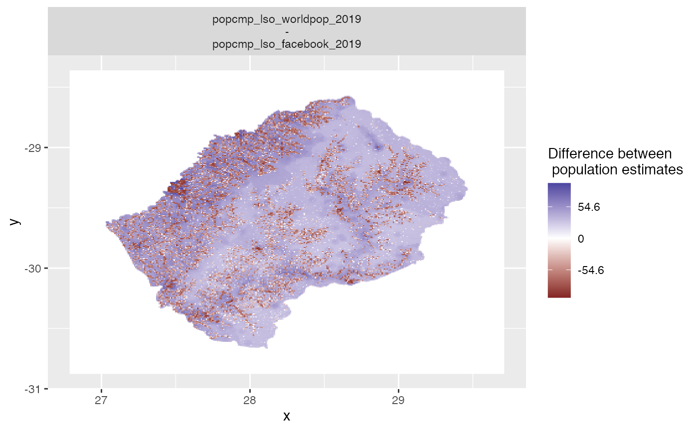
plot_compare and summary_compare are convenience functions to generate automatic plots. The default is map of the differences between the population datasets.
plot_compare(exe)
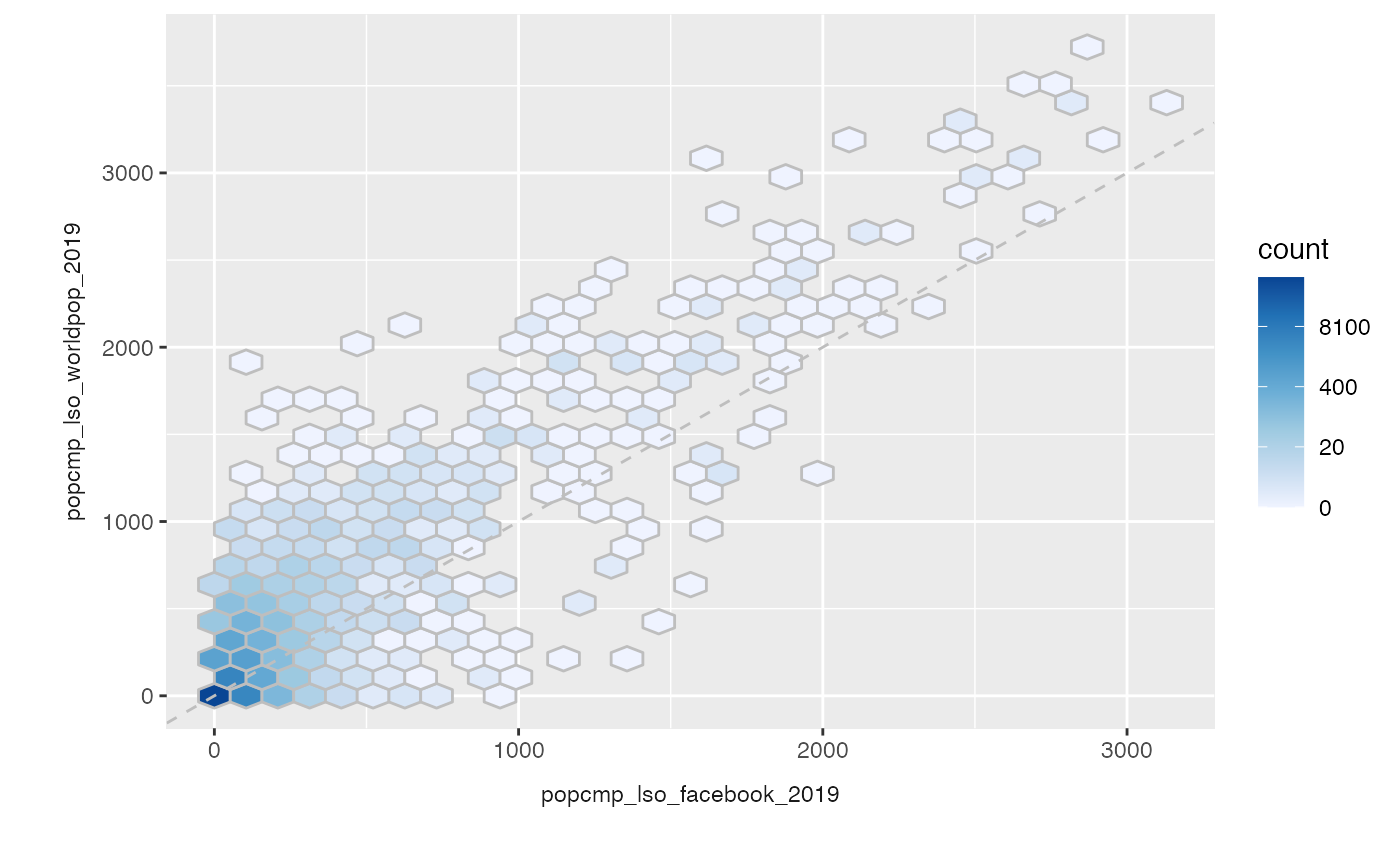
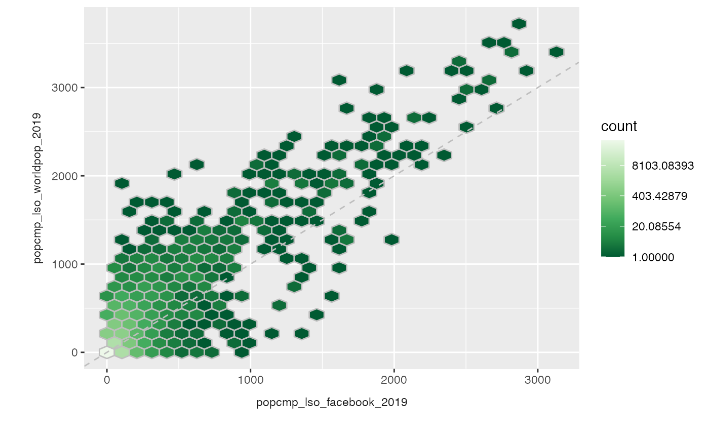
Other options include: - hex plots
plot_compare(exe, type = "hex")
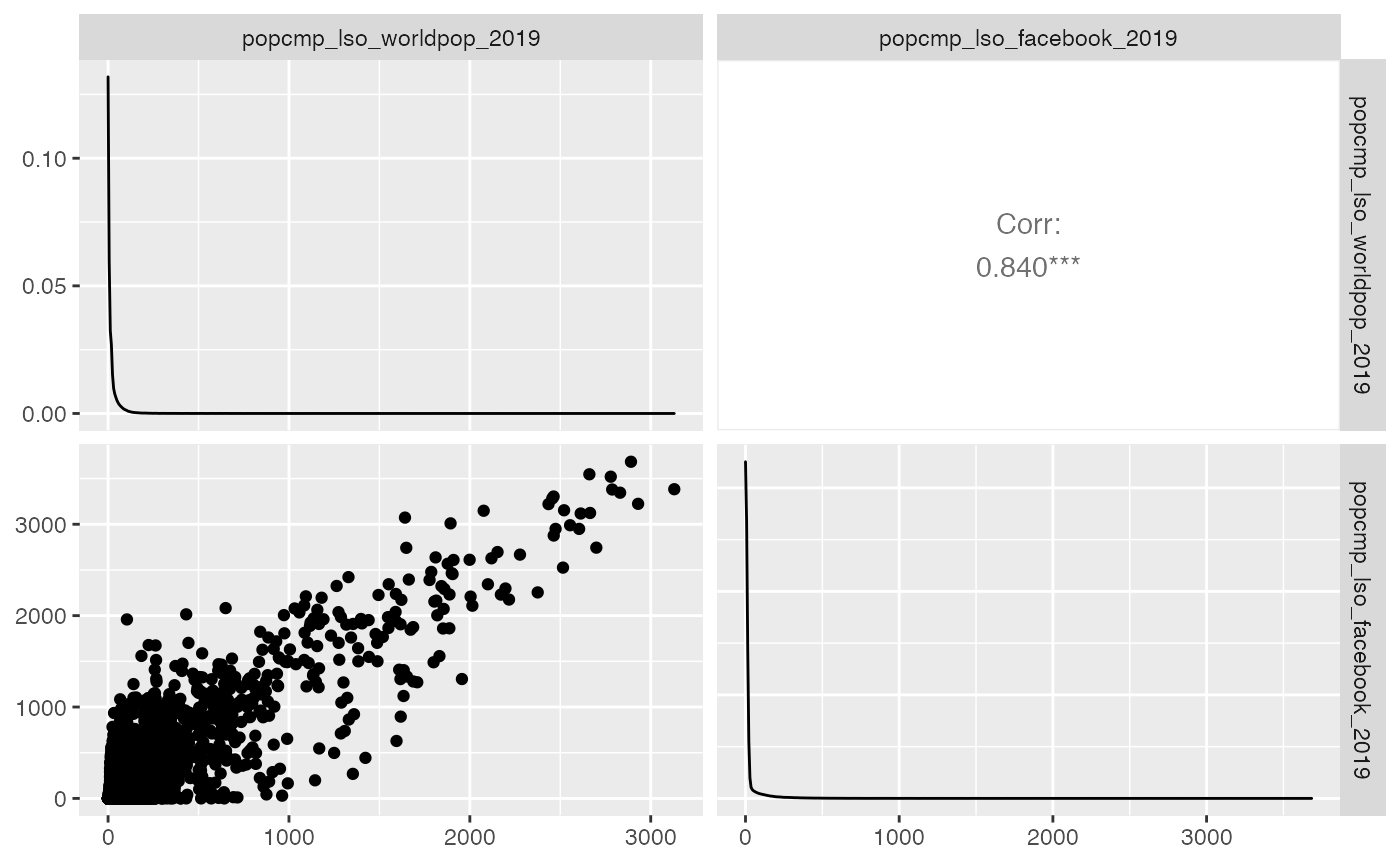
- a pair plot (using function
GGally::ggpairs)
plot_compare(exe, type = "pairs") #> Loading required package: GGally #> Registered S3 method overwritten by 'GGally': #> method from #> +.gg ggplot2
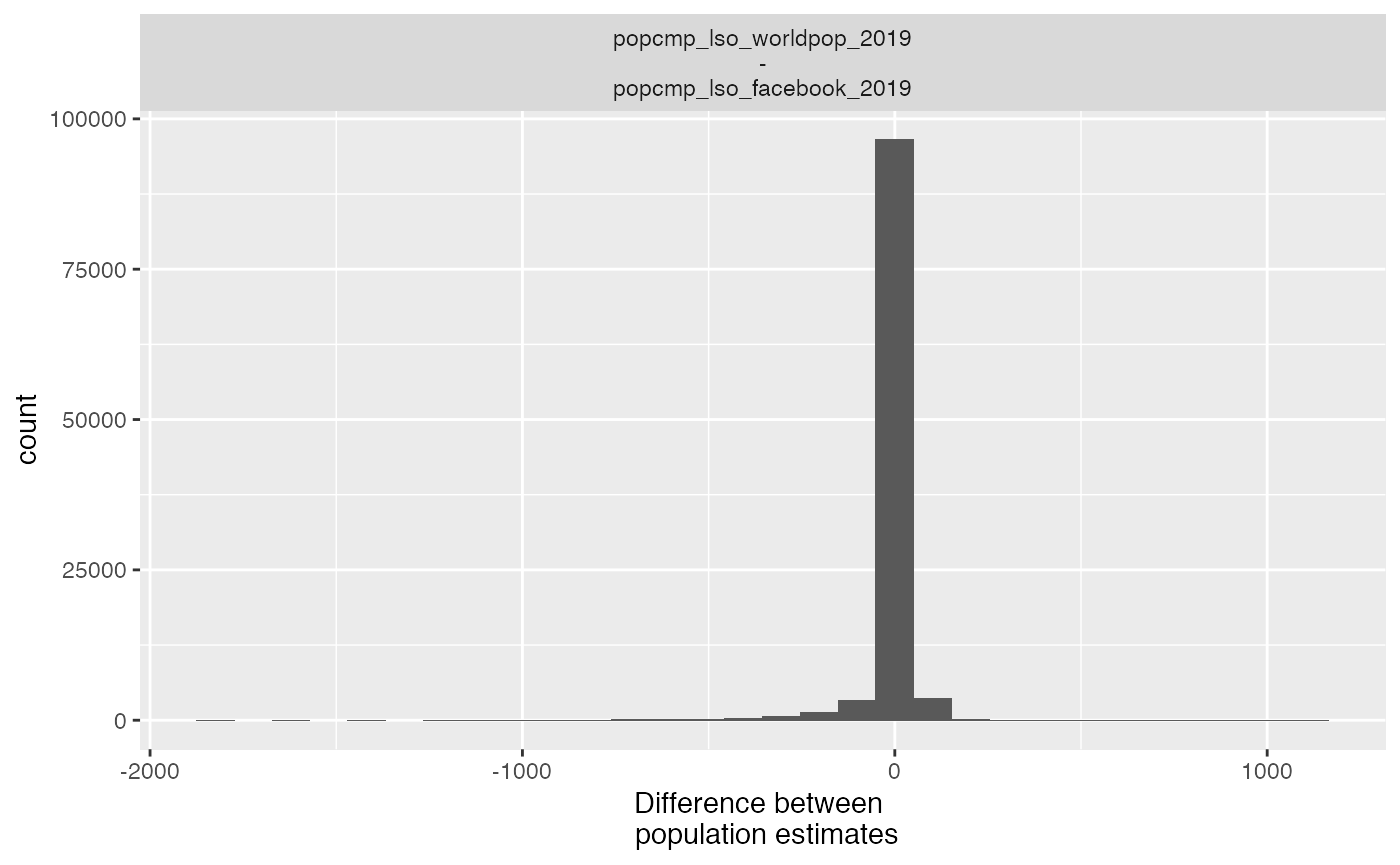
- histogram
plot_compare(exe, type = "hist") #> `stat_bin()` using `bins = 30`. Pick better value with `binwidth`.
All plots are ggplots and as such can be customized by adding scales, themes, etc. You may get a warning if you’re overriding an existing theme.
out <- plot_compare(exe, type = "hex") out + scale_fill_distiller(palette = "Greens", trans = "log") #> Scale for 'fill' is already present. Adding another scale for 'fill', which #> will replace the existing scale.
Note that for the map plots, changing the scales will mess up the labeling of the values. This is known issue that I’ll try to fix!
You can also make these interactive using plotly:
plot_compare(exe, type = "map", interactive = TRUE)